In 2020, in the midst of pandemic lockdown, my husband and I bought a house in Brooklyn and decided to reimagine and rebuild the interior. We began talking through our ideas about how to arrange each detail, from an open kitchen to bathroom fixtures, but before long we realized that imprecise language was slowing us down and annoying us both. So my husband taught me a few key architectural symbols (like the one that shows which way a door will swing) and started printing floor plans. Soon I was drawing my own concepts, iterating on his and working toward a shared vision of the home we eventually designed.
It’s a commonplace story, except for one key factor: I’m blind, and I’ve made it my mission to ensure that blind New Yorkers (including me) can create and explore images. The equipment I used to make our floor plans and my subsequent drawings—a high-tech graphics embosser and a simple tactile “blackboard”—is part of the Dimensions Lab at the New York Public Library’s Andrew Heiskell Braille and Talking Book Library, a place where anyone (blind, sighted, or somewhere in between) can learn to make tactile graphics and 3D models that blind and low-vision people can perceive by touch. As the assistive technology coordinator at the library, I help patrons use accessible tech to pursue their goals: job hunting, reading printed mail with computer vision, using wayfinding apps to travel independently, and more.
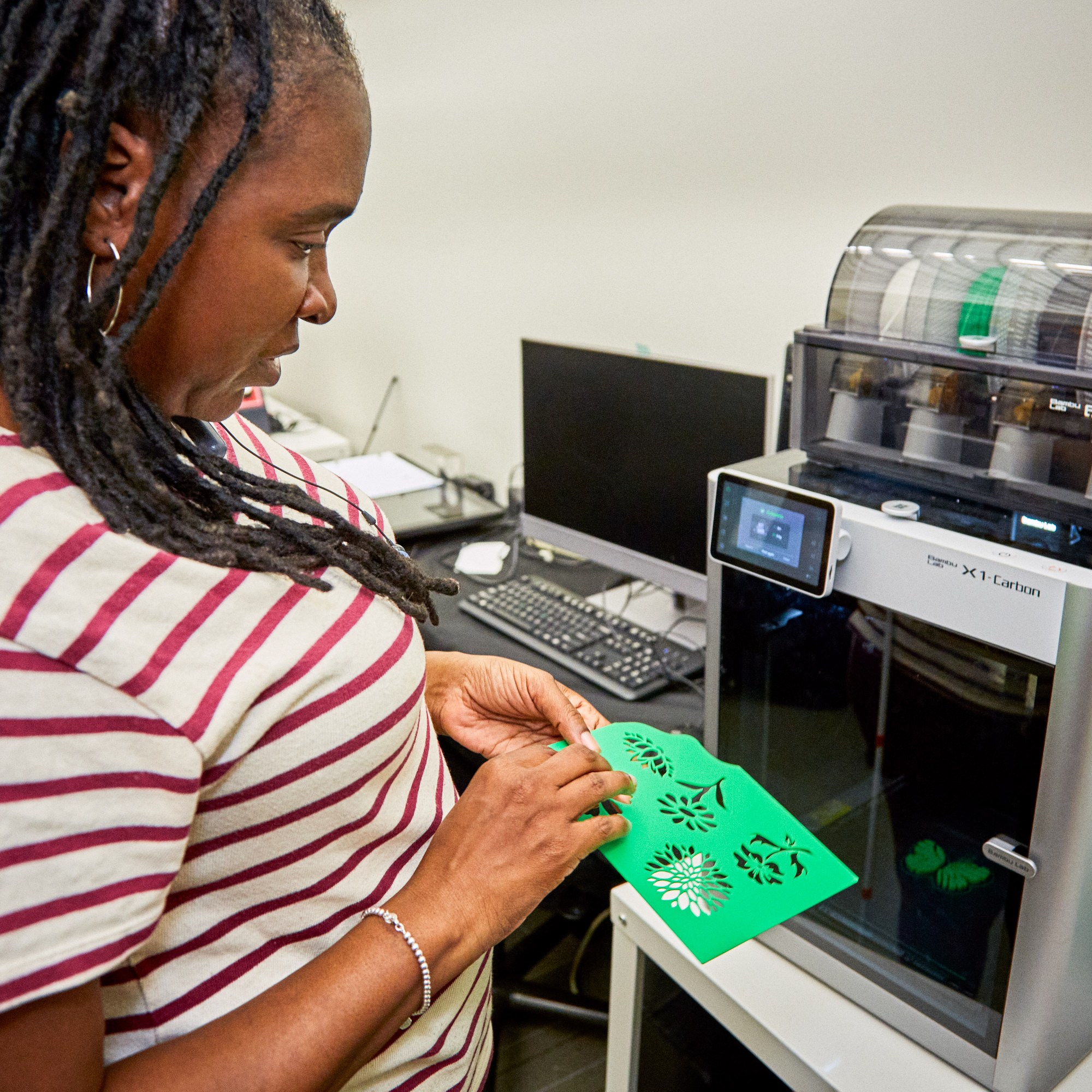
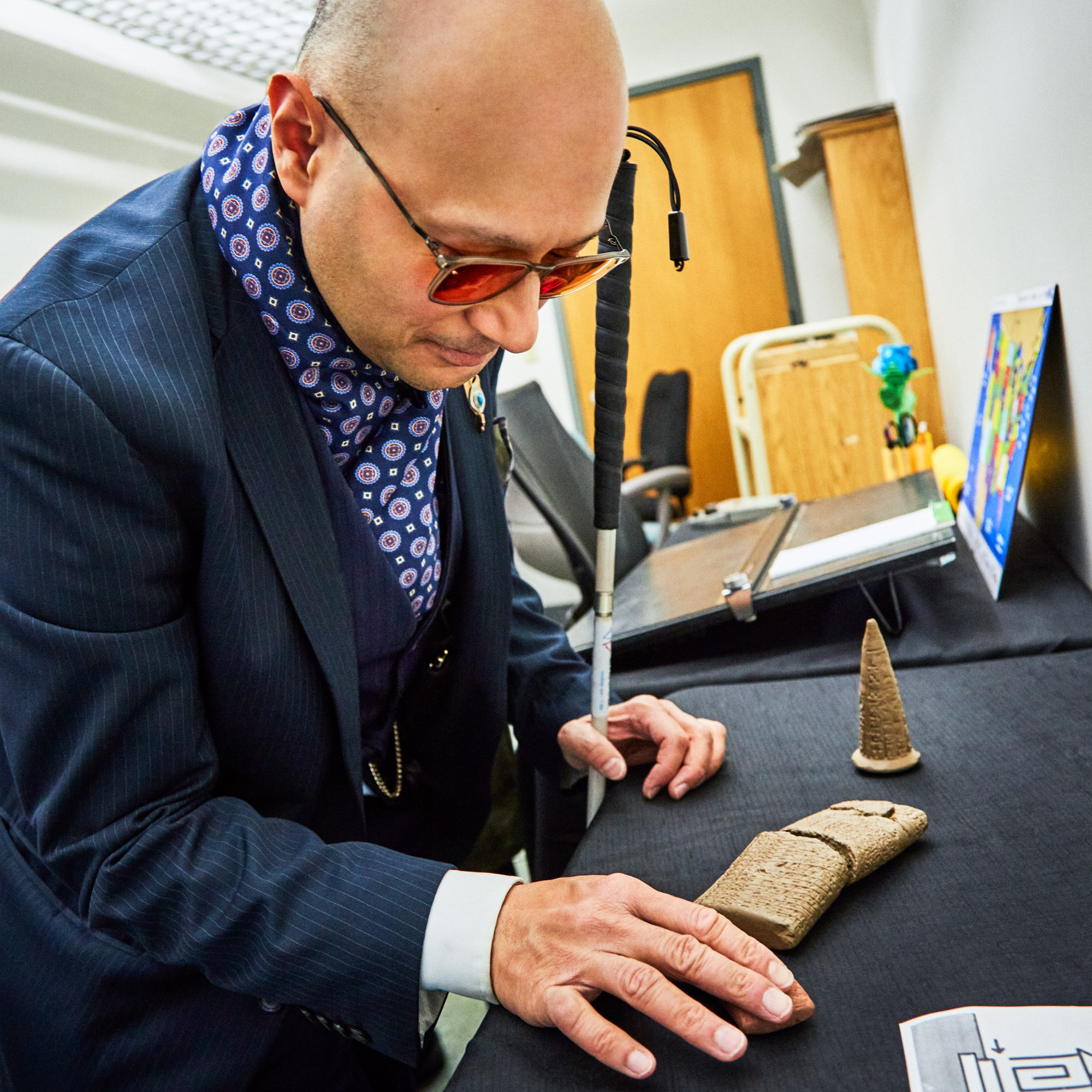
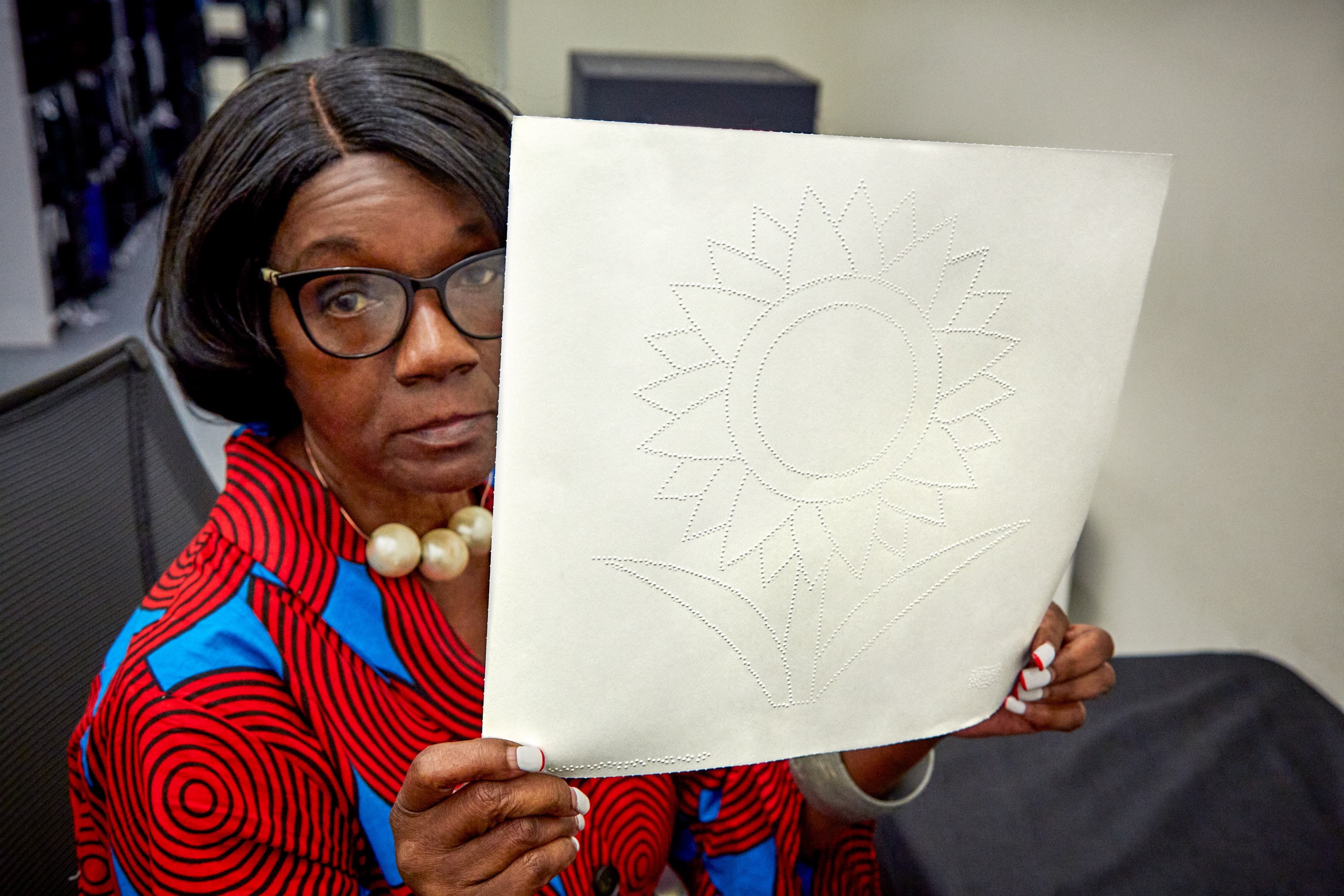
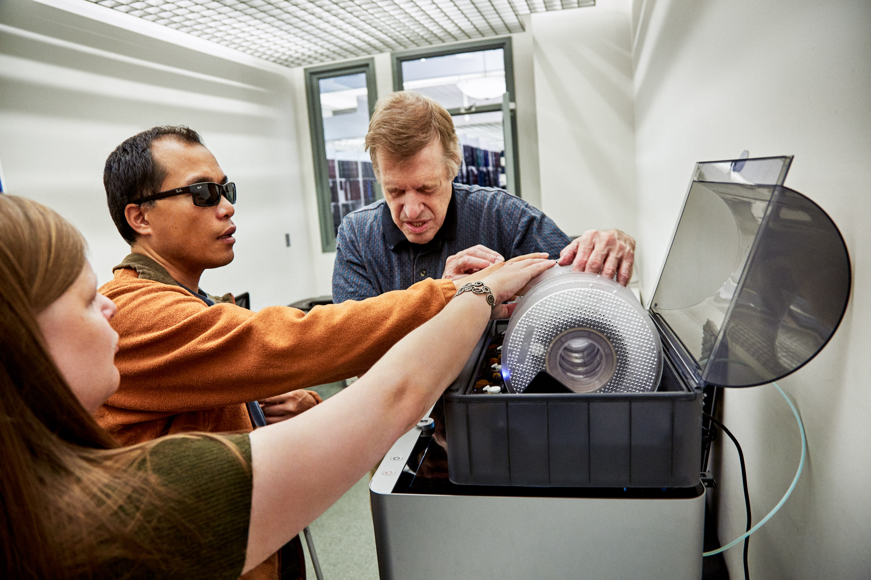
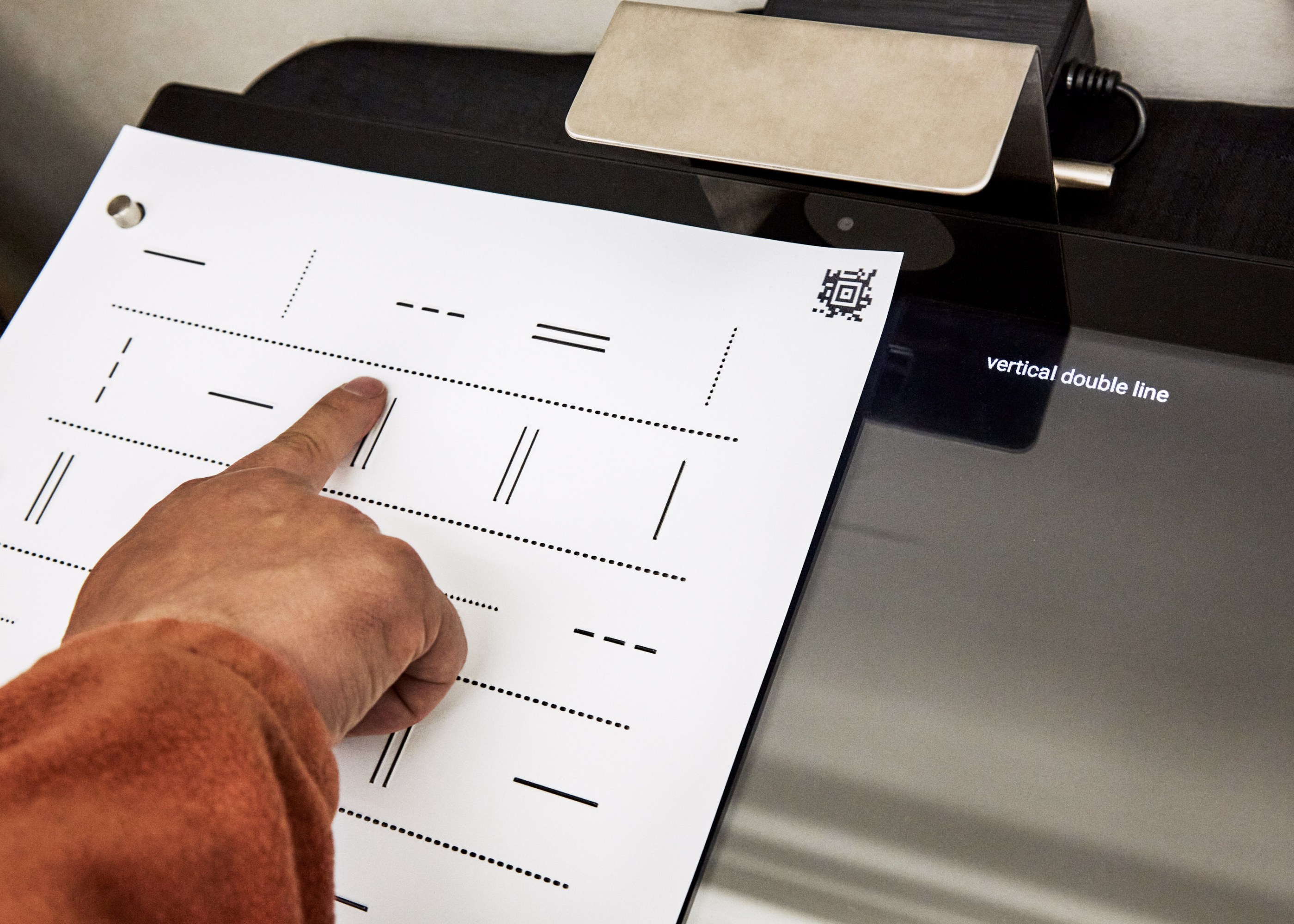
Blind and visually impaired patrons work with various tactile graphics at the New York Public Library’s Dimensions Lab.
Working with images isn’t in the job description for most access technologists like me, but I believe it should be. I dream of a day when checking out a street map, perusing tattoo designs, or making a seating chart are just as convenient and commonplace for blind folks as for our sighted counterparts.
When we talk about graphics and images, the assumption that they will be experienced visually is implicit in the language we use. We refer to the visual arts, visual aids, and data visualizations; we conflate the world of images with the sense of vision as a means of perception. Our predominantly sighted culture centers and disseminates spatial representations that are meant for, and rely upon, vision as a pathway to understanding.
If you think about blind people’s access to content, it’s likely that a few things come to mind: the development and evolution of braille, the availability of text-to-speech and braille output for onscreen content, and the need for accessible websites and apps that conform to guidelines for screen-reading software. While these technologies form a bedrock of access crucial to information literacy for blind and low-vision people, they primarily address one specific type of information: text.
In an era when lectures, business presentations, news, and entertainment are almost always delivered with rich, often interactive visuals, those of us who are blind usually find ourselves relegated to a text-only experience. Although alt text—the description of images online—allows content authors to describe important visuals, the adage that “a picture is worth a thousand words” falls flat when only words are available. It’s important to experience a stock chart, a circuit diagram, or a map as intended—that is to say, as an image. Textual descriptions of items like these, if they contain all the information in the original image, are painfully verbose and frequently fail to deliver pertinent insights with the precision of an image.
The power of images to convey information precisely and concisely through spatial representation, however, isn’t inherently visual at all. For blind readers, learners, and creators, tactile graphics—images rendered legible by touch—open up the world of spatial communication.
Tactile graphics
As a blind tech educator, it’s my job—and my passion—to introduce blind and low-vision library patrons to tools that help them move through daily life with autonomy and ease. Our team of blind and sighted staff and volunteers runs group workshops and individual appointments that aim to give everyone the confidence to print existing graphics or make their own.
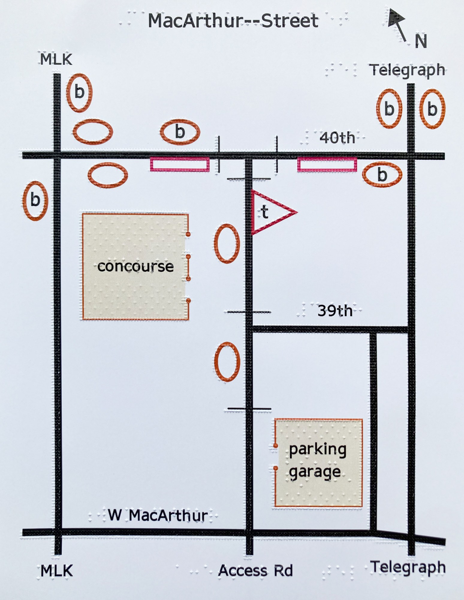
In 2016, a blind patron new to New York City called me up with a simple request: he wanted a map of the five boroughs, showing their shapes, relative locations, and sizes. I answered this inquiry with some leads to braille textbook publishers who make maps, but I soon started to wonder: What should blind people do when they want a tactile graphic that doesn’t yet exist? Why had I seen more tactile graphics as a child, in textbooks, than at any other time since? What would need to happen to create a straightforward path, navigable by any blind or low-vision person, between feeling curious about a given image and having a tactile version of the image in hand?
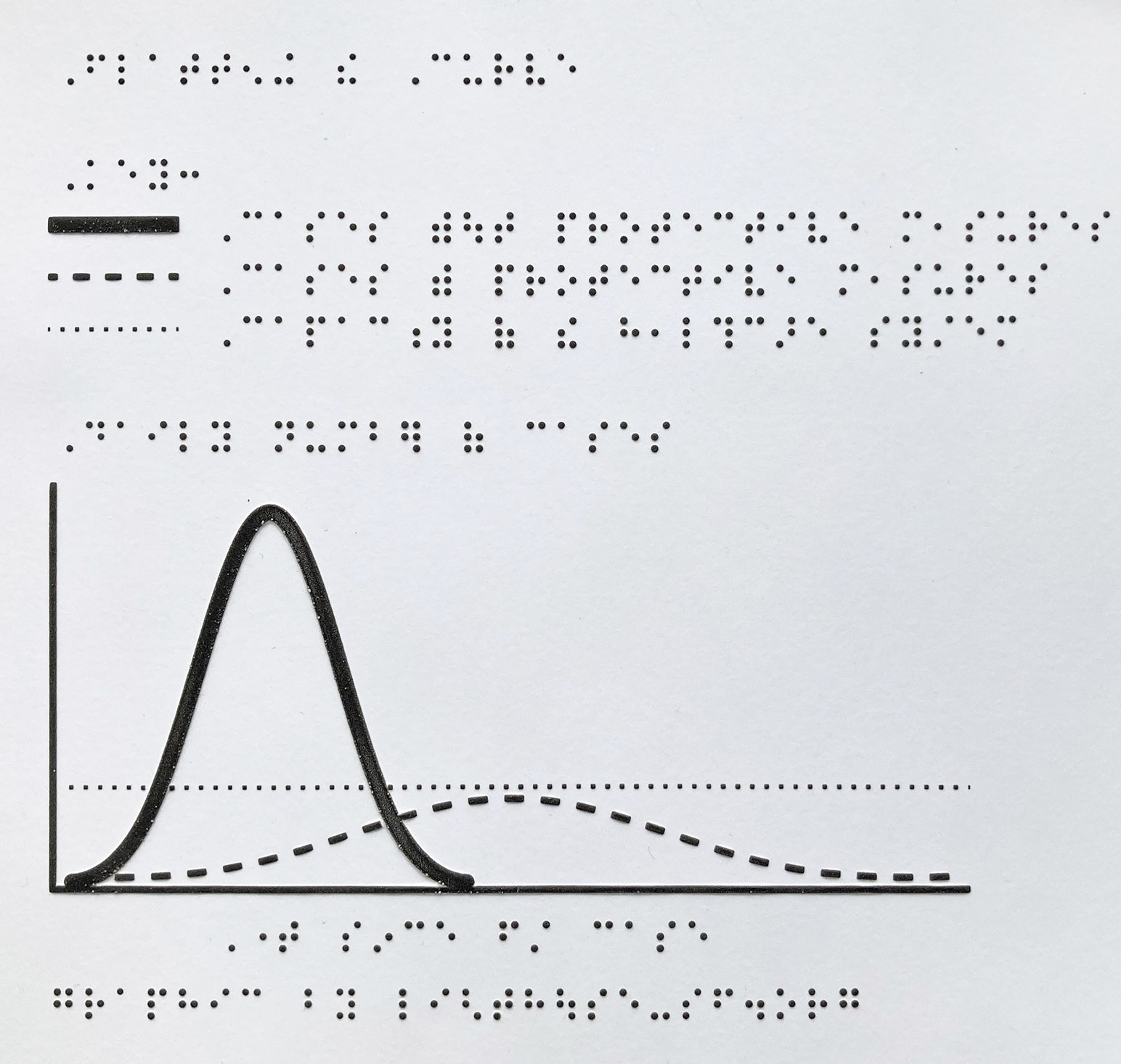
Tactile graphic design is an art of transformation: what appeals to the eye may be cluttered and chaotic to the fingertips. The legibility and impact of a tactile graphic depend on the author’s grasp of practices for conveying information by touch. Since perceivable tactile resolution is much lower than resolution perceivable by vision, it’s imperative that tactile graphics be scaled up enough to make key elements detectable. Since color isn’t within the scope of tactile design, other methods must be used to draw distinctions. For example, a tactile pie chart might use four different textures (untextured “white” space, dotted infill, squares, and stripes) to differentiate four wedges. The classic “flatten the curve” graphic, which used colored lines to convey dramatically different public health outcomes for covid-19 with and without protective measures, is just as effective as a tactile graphic when dotted, dashed, and solid lines are employed to communicate the message.
I dream of a day when checking out a street map, perusing tattoo designs, or making a seating chart are just as convenient and commonplace for blind folks as for our sighted counterparts.
The technology required to create high-quality tactile images is typically found in institutions—textbook publishing companies, university disability service offices, and administrative areas within schools, for example. As a result, tactile graphics are usually created to meet institutional priorities, and they are mostly designed, produced, and distributed by sighted people. I realized that a free and open tactile graphics lab would need to provide three things to change this paradigm: easy access to tactile graphics equipment, a focus on hardware and software that are accessible by nonvisual means, and pathways for blind people and our allies to build skills and confidence in working with tactile graphics, regardless of previous experience. With this in mind, and with the help of a grant from the NYPL’s Innovation Project for employees, I launched the Dimensions Lab.
A visit to the Dimensions Lab always begins with a chat about the project at hand and a chance for patrons to flip through a portfolio of samples made with a variety of processes. There’s graphics embossing, which quickly (and loudly) punches dots of eight distinct heights onto paper or cardstock at up to 100 dots per inch; Swell Form, which involves feeding patented microcapsule paper through a heated machine to raise lines through a chemical reaction between alcohol embedded in the paper and carbon in the ink; and thermoform, my favorite throwback. First developed in the 1960s—before braille book transcribers had access to software to help with translations and revisions, let alone graphics—a thermoform machine gets as hot as a pizza oven and uses a vacuum seal to impress a specialized thin plastic sheet with a copy of the material below, whether that’s hard-copy braille, an illustration embossed onto a metal sheet, or a tactile relief image made from materials like wire, sandpaper, and foam.
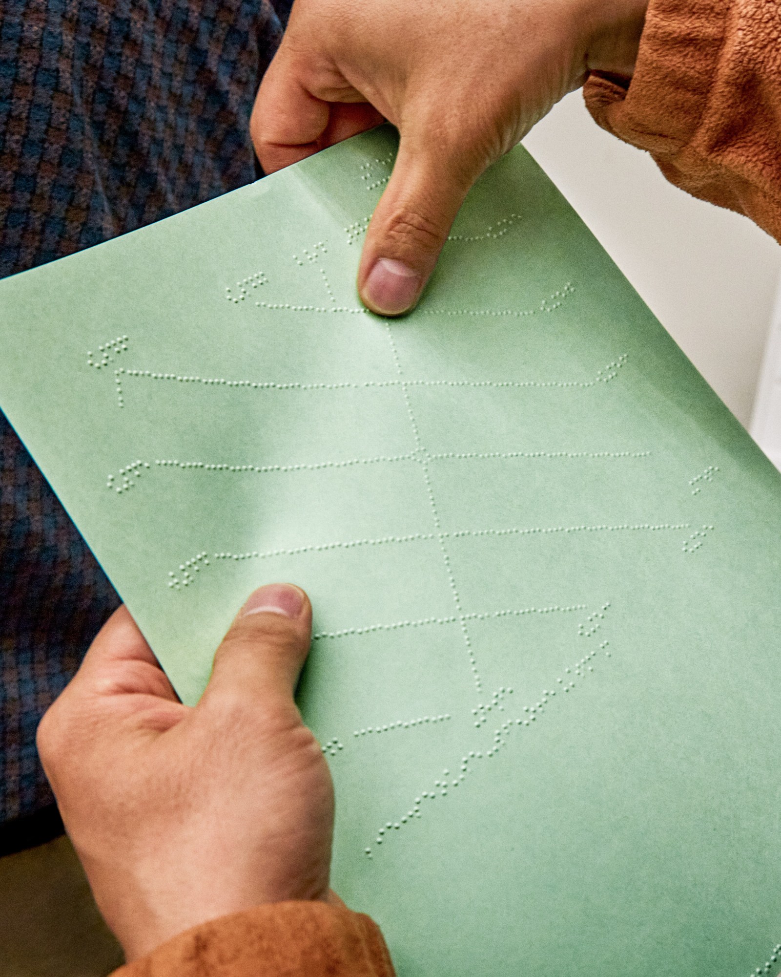
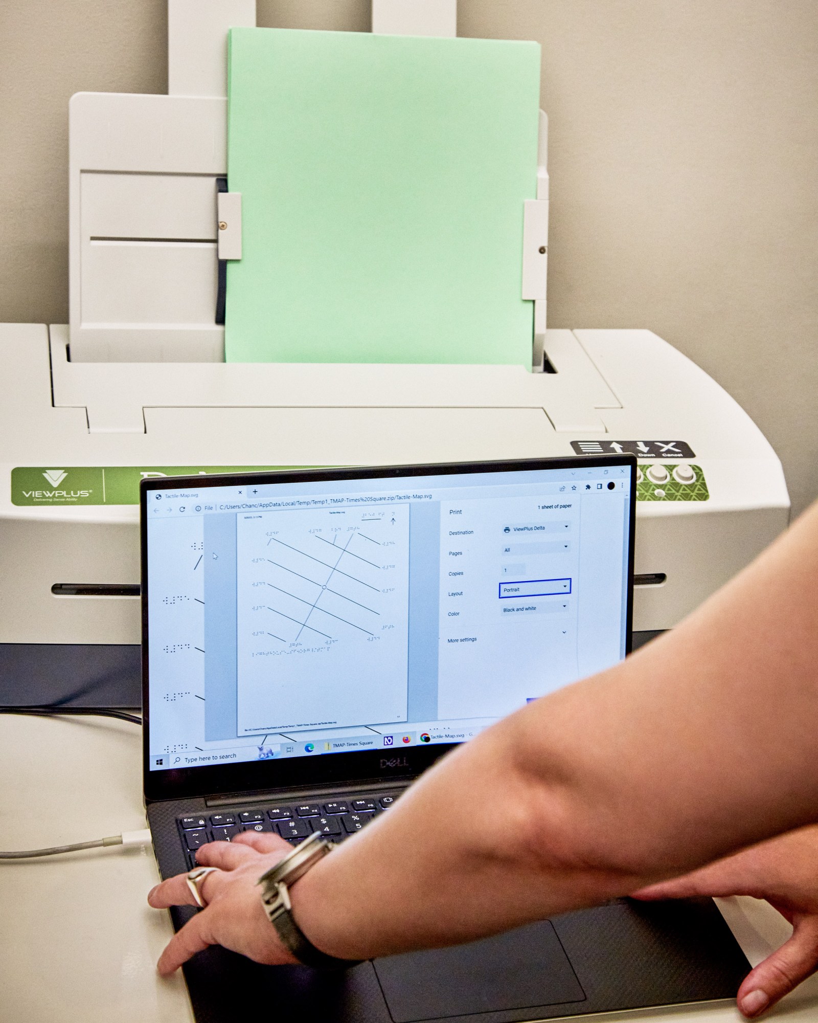
A graphics embosser at the Dimensions Lab can quickly punches dots of varying heights onto cardstock.
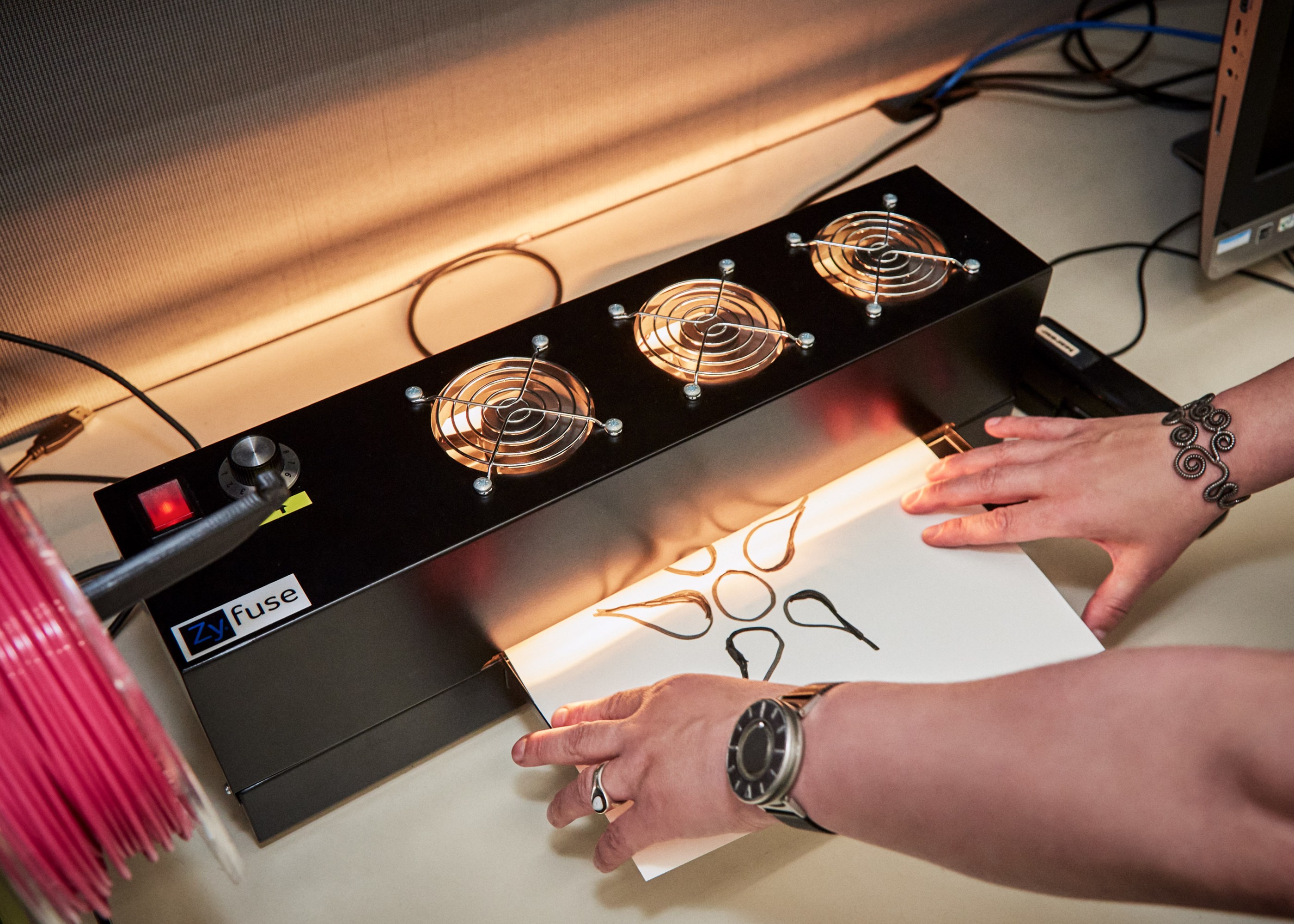
Alongside equipment designed specifically with production of tactile graphics in mind, our lab offers mainstream hardware that can be put to use to create other tactile media. Most methods for creating tactile graphics offer a sort of “2.5D” representation, using lines and shapes usually raised well under a millimeter, but 3D printing allows for the creation of full models. It doesn’t suit every tactile need: the method, in which a plastic filament is pushed through a heated nozzle and deposited layer by layer to form the desired shape, is comparatively time consuming. Other approaches work just as well for representing drawings, charts, and graphs. A 3D model may be best, however, when the original object is three-dimensional but can’t be touched because it’s too small (like a molecule), too big (like an elephant), or too delicate.
As it turns out, the New York Public Library’s Manuscripts, Archives, and Rare Books Division houses items of the too-delicate variety in abundance, including a series of clay cuneiform tablets dating back to 2500 BCE. As a proof of concept shortly after the launch of the lab, we worked with NYPL’s digital team to capture some of them through photogrammetry, a technique archaeologists use to turn photos into 3D models. I had read about cuneiform in textbooks and thought I understood it: I imagined heavy clay tablets, paper-shaped but brick-heavy, carried in two careful hands. Our 3D models, which now move among library branches and schools in interactive classroom kits, told me more about the tangible reality of cuneiform than a textbook ever could. They’re rounded cylinders and rectangles, densely inscribed, close to palm-sized and so deeply engraved that I wonder whether an official scribe or some other person might’ve read them by touch, whether because of blindness or for lack of a candle.
Blind folks learn to assess the progress of a 3D print by sound (a doomed print often fails audibly as misplaced filament scrapes, bumps, or drags), and by gently touching the filament as it enters the tube to make sure material is flowing. The things that might give you trepidation if you closed your eyes—using touch strategically and safely to monitor and maintain a machine that has hot parts, or using wire cutters and tweezers to unclog and reload the filament—are actually easy to accomplish nonvisually once you learn how.
Software is another matter, though. There is, at present, no commercially available equivalent to a dynamic screen for tactile representation. (Although digital braille displays use pins to pop up one line of braille at a time, those don’t have sufficient resolution or space to show images.) Tactile graphics must be printed to be read by touch. Imagine sending every image you encountered off to a printer and waiting (usually for a minute or more) before you could view it. For now, tactile readers miss out on the expediency and fun of zooming in from the big picture to minute details. If you’ve ever used a digital map to explore the streets around that reassuring “you are here” pin, you know what we’re missing and why it matters.
Blind people working with graphics are endlessly hampered by the need to print every image, especially because it’s rare for an unaltered visual image to make a legible, pleasing tactile one. An image might seem promising but turn out to have white space that needs cropping before it can be scaled up, or a light gray background that translates into a sea of distracting dots. Time spent printing every picture we have a passing interest in adds up. Minh Tam Ha, a blind colleague in the movement for tactile graphics education and access, noticed her friends and family finding comfort and calm through coloring during lockdown, so she decided to curate coloring pages from the web that work well for tactile readers, emboss them, and mail them out on demand. Each of these finds was hard won, Minh says: “Finding clear and crisp images that would translate well was very much a hands-on-paper endeavor where I couldn’t use visual assistance to speed up the process. An image could be a simple flower in a pot with leaves, but if the lines were too bold or too close to each other and not clearly defined, it could mean that tactilely, the image was indecipherable.”
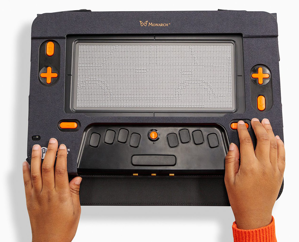
An effort is underway, though, to put digital tactile graphics under the fingertips of students and adults. The Monarch, a tabletop device featuring a refreshable braille display 10 lines by 32 cells in size, is set to enter field testing in schools and other community settings this fall. The project is a collaboration between the American Printing House for the Blind, a nonprofit focusing on nonvisual, braille, and tactile literacy in the education sector; Humanware, an assistive technology company with a strong track record in the field of digital braille displays; and the National Federation of the Blind, a civil rights and advocacy organization leveraging the expertise of its members to improve equity and inclusion for blind Americans. When I tested the Monarch earlier this year, I zoomed in from the outline of the United States to individual regions, panned around a detailed floor plan of a conference center, and gave a dozen images a quick tactile glance within a minute before choosing the ones I wanted to explore in depth. Compared with methods for creating hard-copy tactile media, the Monarch’s output feels low-res and monochromatic (just one dot height is supported for now). But the chance to explore any given image in detail without waiting more than a moment felt like a new and remarkable power to have.
Meanwhile, poor interface design is still a barrier to overcome. Popular computer-aided design programs, including Inkscape and Adobe Illustrator, fail to conform to well-established development guidelines that would make their menus and dialog boxes accessible to screen readers, which excludes blind users from simple tasks like rescaling, rotating, or outlining an image. If blind students or adults aren’t in touch with advocates who can suggest more accessible workflows, they’re likely to give up on digital design when the roadblocks become apparent. Those of us who persevere in design become creative, eclectic problem solvers: we make our own access by co-designing with sighted allies, hand-coding lines and shapes, drafting by hand with tactile tools, or using proprietary software (like Thinkable’s TactileView) that allows us to create and move objects and incorporate labels using an accessible menu system.
Learning what’s possible
Very little of what I’ve learned about tactile graphics was taught to me formally. Instead, I’ve relied on a web of blind folks and sighted allies who have themselves learned from a friend or through experimentation. Engaging with graphics as a blind person requires access to both equipment and a community of practice. Fundamentally, we need what everybody learning about technology needs: mentorship, support, accessible tools and a chance to build skills with them, and a glimpse of what’s possible.
My first few months at the Dimensions Lab were strangely quiet: I had expected droves of people signing up to make accessible graphics for free. But when I told patrons about the lab, more than one of them asked me: Why would they want graphics?
We are so accustomed to living in text-only mode that we often don’t know where to start with tactile images, and we might not even think of ourselves as missing out. These days, I keep a wide variety of tactile graphics on hand to show different kinds of patrons why images matter. A colleague contributed her excellent handwriting to a beautiful, scaled-up cursive alphabet that blind people can consult as they work to refine their signatures. A web app called TMAP, invented by the blind designer and tactile cartographer Josh Miele and provided free of charge by the LightHouse for the Blind and Visually Impaired in San Francisco, generates tactile street maps on demand for any address. And Minh Ha’s coloring pages of guide dogs in harnesses, flower bouquets, and intricate mandalas pair nicely with braille-labeled crayons to provide a gentle, joyful introduction to imagery for all ages. Once patrons encounter a tactile graphic that’s meaningful to them, they can begin to imagine what else they might like to explore.
As I think back to the moment when I first felt our new house’s floor plan under my fingertips after struggling to imagine it through words, I remember the rush of understanding, a sudden release from frustration and confusion. I felt almost spoiled by precision and ease: a tactile graphic was the ideal tool to help me envision our future home and make decisions about it with confidence. As a tech educator, sparking that moment of tech euphoria for someone is the best part of my job. Some patrons experience it when they use an accessible compass on their phone, download a book for the first time, or turn on audio description for their favorite show. Patrons come to me for help with technology but leave—if I’m doing my best work—with a belief in their own abilities and excitement about exploring tools that enhance their skills. Tactile graphics can unlock strengths and possibilities in spatial learning and creation that blind and low-vision patrons might never have considered.
Though the technical limitations involved in making these graphics are significant, lack of access or even awareness is a larger problem. People without access to graphics don’t demand them, and they’ll rarely receive what they don’t demand. Along with a growing movement of blind people and allies, I’m trying to break that cycle.
For three days in March, the library’s community room hosted an inaugural tactile art teach-in. Participants learned to draw by hand using a low-tech product called the Sensational BlackBoard to raise tactile lines on ordinary paper with ballpoint pens. They used sound cues and ribbons run through frames to learn about perspective. They explored maps and wrote code to make digital drawings. Together, we shared a space where nonvisual access to images was not just expected but celebrated, and where everybody understood that engaging with images for the first time, or the first time since vision loss, can be hard and vulnerable work. We confronted the stark reality that most of us have become habituated to a state of image poverty and affirmed that we need, deserve, and can flourish with access to tactile images. We demonstrated that image poverty in our community is avoidable.
Image literacy is important, from a blind baby’s first picture book to the maps, charts, and graphics that help us understand what words fail to capture. If we act from the proposition that images are for everyone, we can create that reality.
Chancey Fleet is the assistive technology coordinator at the New York Public Library.

